

Brand Guide
Use the following guidelines when creating content for Habitly.
Purpose
There are a lot of great books, articles, videos, and research on habits and behaviors. There are a lot of experts who can tell you how to improve.
But people and businesses need practical tools and services they can use to adopt, improve, and reinforce good habits, behaviors, and soft skills.
“I tried what you said and it was amazing”
Over decades of business experience and consulting, our most rewarding moments have come when a client applied our advice, changed their behavior, and experienced a profoundly positive affect.
One person was dealing with an irate customer every week. They were beaten down, exhausted, and demoralized. They didn’t know how to handle the stress.
After we advised them on how to stay calm and deal with the situation properly, it was a revelation. They reported back that they were able to stay calm, avoid confrontation, and strengthen relationships instead of damage them. They were happier at work, and more fulfilled when they went home at the end of the day.
The Same Impact on a Larger Scale
We are on a mission to make the same impact on a larger scale. Habitly provides the same powerful teaching and expertise to everyone:
In an easy-to-use, accessible format
With excellent, engaging content
And regular reminders
At a much lower cost than in-person training or coaching
Our Brand Statement
This statement communicates the Habitly brand:
Habitly is the most engaging way to learn how to succeed in the workplace.
Habitly is…
The Habitly brand communicates 3 words: Productive, Educational, Engaging.
These are the feelings, the intuitive messages we want people to receive when they see anything related to Habitly.
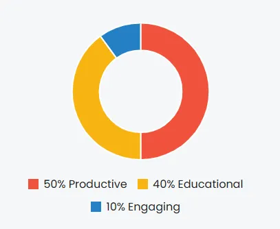
Productive - 50%
competent
accomplished
capable
results-oriented
Educational - 40%
learning
growing
improving
changing
Engaging - 10%
fun
easy
enjoyable
entertaining
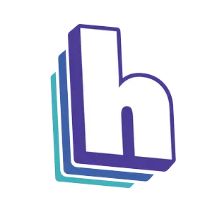
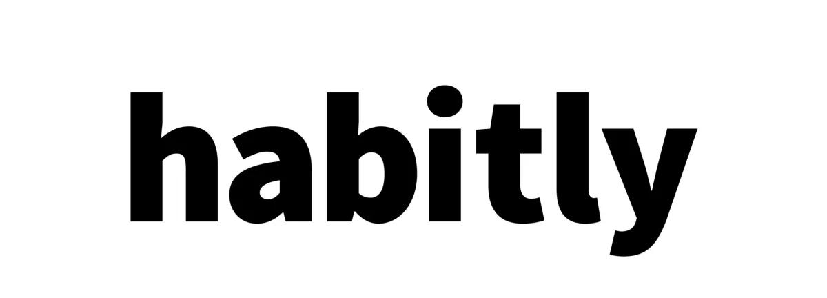
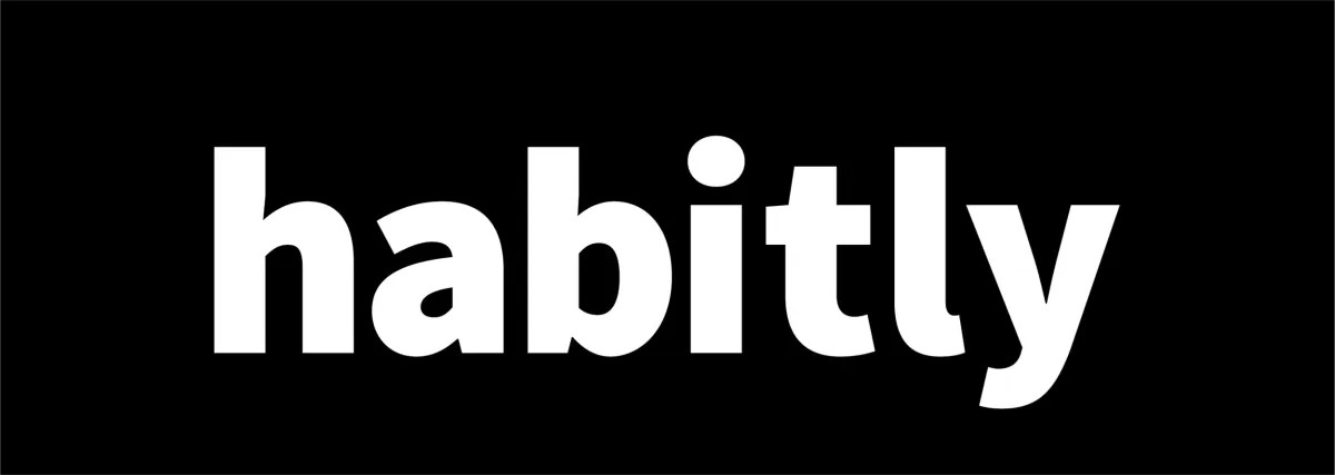
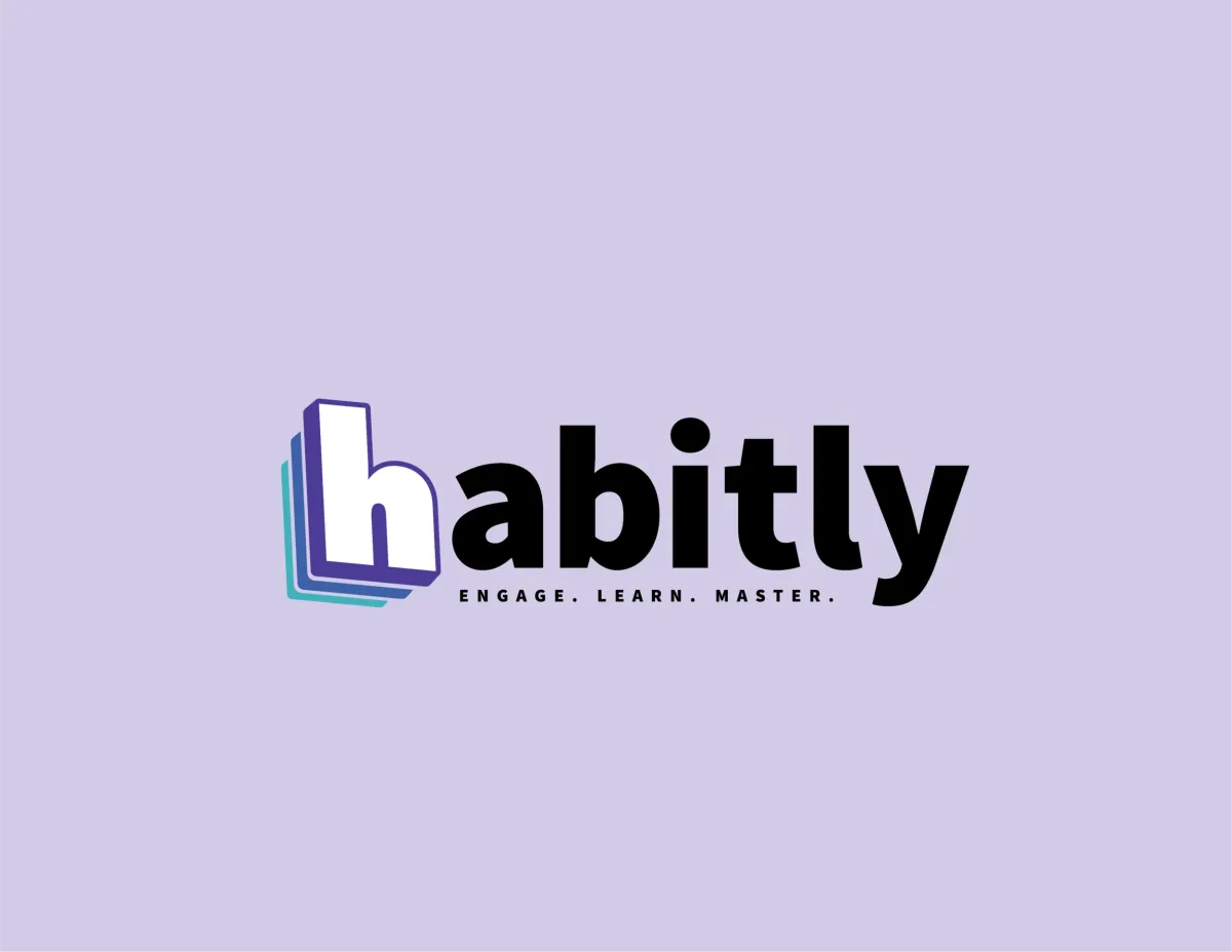
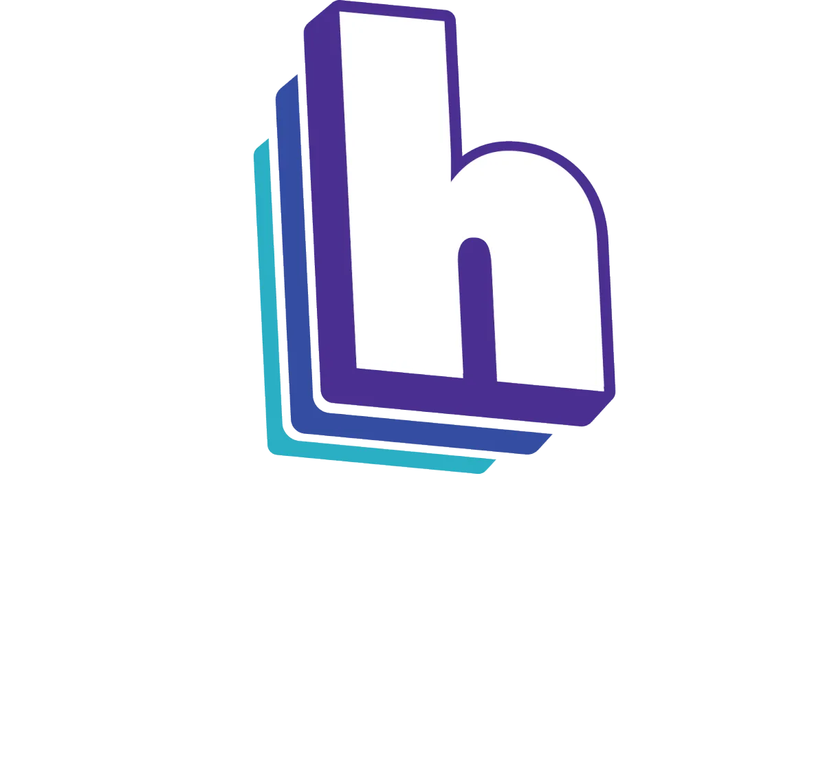
Logo
The Habitly “h” is the face of our brand. This icon and our lowercase wordmark are our most recognizable brand assets.
The preferred approach is to use the icon logo by itself, unlocked from the wordmark. This allows flexibility to present the icon with greater prominence while maintaining a considered, open and modern presentation.
However, the “h” and the wordmark can also be combined quite nicely.
ICON


WORDMARK
ICON and WORDMARK
combination

Colors
Our purple is strong and confident. However, it only plays a leading role and it is happy to delegate. It is supported by our business blue, and both are highlighted by our teal.
Our palette leverages multiple colors to appeal to a wide audience. It evokes a sense of professionalism with a dash of excitement.
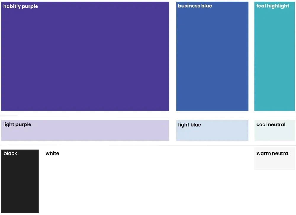
habitly purple:
Hex: #4d3a97
RGB: 77 58 151
CMYK: 86% 93% 0% 0%
light purple:
Hex: #d1cae5
RGB: 209 202 229
CMYK: 16% 18% 0% 0%
business blue:
Hex: #4d3a97
RGB: 77 58 151
CMYK: 86% 93% 0% 0%
light purple:
Hex: #d4dff2
RGB: 212 223 242
CMYK: 15% 7% 0% 0%
teal highlight:
Hex: #47b1bb
RGB: 71 177 187
CMYK: 67% 10% 26% 0%
cool neutral:
Hex: #e8efef
RGB: 232 239 239
CMYK: 8% 2% 4% 0%
warm neutral:
Hex: #f2f2f0
RGB: 242 242 240
CMYK: 4% 2% 4% 0%
black:
Hex: #212121
RGB: 33 33 33
CMYK: 72% 66% 65% 73%
Typography
We’re gonna skate to one font and one font only: Poppins. Well, that’s not true… we technically utilize two fonts: Poppins and Source Sans Pro.
However, only the Habitly logo uses Source Sans Pro. We use Poppins for everything else.
Source Sans Pro
We only use this font for the wordmark
part of the Habitly logo.
Poppins
We use this everywhere else. In courses, episodes, guides, webpages, images, infographics, collateral... everything.
Other
Next sections:
Copy
Music
Shapes
Symbols
Textures
Layout, Art
Photography
Male/Female models
Male/Female styles
Locations
Solutions
About
Copyright ©2005-2026 Manage 2 Win All rights reserved. Privacy Policy Terms of Use